Balanced Whitespace
Child controls composed within a grid layout cooperate for space. Balance the whitespace between controls to make them appear as a cohesive whole. Let each control claim the whitespace surrounding it, so that they can work within any container.
Structure
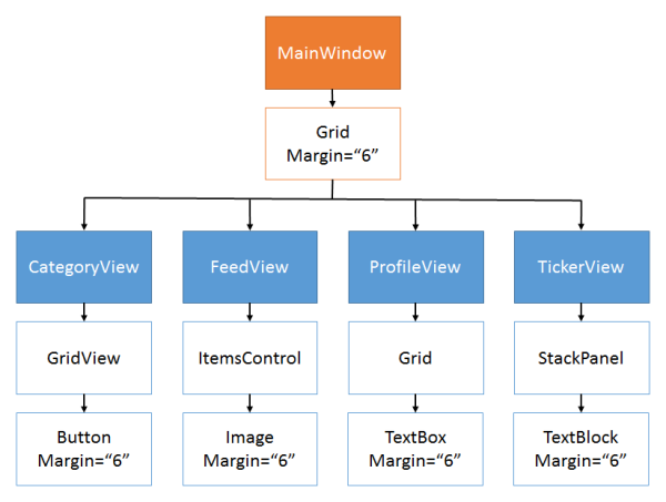
The window or page contains grids and stack panels, which contain user controls. Eventually, they contain leaf controls like text boxes and buttons. The leaf controls are given a margin, as is the top-level grid.
Design
Each leaf control specifies a margin around itself. The margin represents half of the whitespace separating leaf controls.
Containers such as grids and stack panels do not specify a margin around themselves. Neither do they add a margin to their child controls. They simply let adjacent leaf controls combine their margins into internal whitespace.
The page or window places a margin around the top-level grid to provide the other half of the external whitespace.
The resulting grid lines cut through the center of the whitespace.
XAML
User controls assign a margin to leaf controls such as text boxes and buttons.
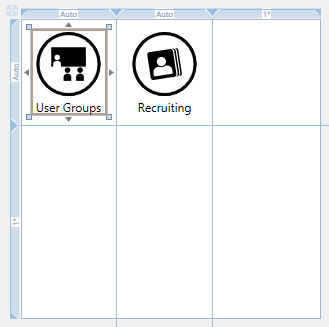
<c:IconButton Margin="6"
    Content="User Groups"/>
<c:IconButton Margin="6"
    Content="Recruiting" Grid.Column="1"/>
On Windows Phone, the default template of many leaf controls includes a margin. On this platform, the user control does not declare any additional margin.
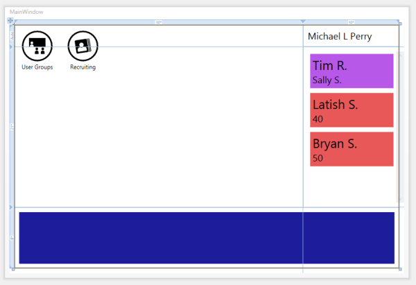
The window or page places an additional margin around the top-level grid so that the outside whitespace is the same as the inner whitespace.
<Grid Margin="6">
    <!-- -->
</Grid>